GAYDON, U.K. – Jaguar is starting at ground level as it seeks to rebuild the brand’s cachet as one of the world’s most desired marques, one that harkens back to founder William Lyons’ statement that a Jaguar should be a “copy of nothing.”
Whether the design team behind carrying that ethos into the 21st century is successful in the marketplace remains to be seen, but this much is certain: The edict to “copy nothing” in redefining the brand and its products marks a startling departure from its storied and now-distant past.
“Our vision for Jaguar today is informed by this philosophy,” says Gerry McGovern, chief creative officer, calling the new branding “exuberant modernism” that “is imaginative, bold and artistic at every touchpoint. It is unique and fearless.
“This is a reimagining that recaptures the essence of Jaguar, returning it to the values that once made it so loved, but making it relevant for a contemporary audience. We are creating Jaguar for the future, restoring its status as a brand that enriches the lives of our clients and the Jaguar community.”
The makeover begins with branding, in the form of trademarks and exclusive fonts used to express the Jaguar name, a “strikethrough” graphic intended to give the brand presence and visual identity, a revised “leaper” image and use of vibrant, primary colors – blue, red and yellow.
The branding shown here comes together in the Design Vision Concept premiering Dec. 2 during Miami Art Week in South Florida. Until then, the concept and its particulars remain under wraps, although the automaker did release a photograph of a heavily camouflaged development prototype based on the concept undergoing road testing recently outside the company’s headquarters here in the British Midlands.
The prototype purports to be a 4-door GT based on the Jaguar Electric Architecture and scheduled for production beginning in mid-2025. Published reports indicate a range in excess of 400 miles (644 km) and pricing as high as $164,500.
Camouflage conceals coming battery-electric 4-door GT.
In the meantime, a review of Jaguar’s new-look branding reveals the level designers took to distance the marque from its past, while still embracing some of its heritage that many – including none other than Enzo Ferrari – believe reached its high-water mark with the debut of the 1961 E-type at the Geneva Motor Show.
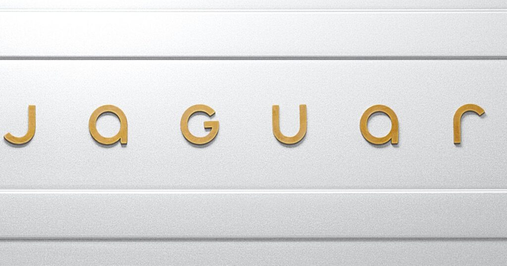
The Jaguar nameplate/badge – or Device Mark – employs a series of sans serif letters in upper and lower case, producing what would be expressed in type as JaGUar, if reproduced literally. The effect is one of clean simplicity, while also evoking an artistic and premium feel that echoes Jaguar’s storied past.
The so-called Artist’s Mark monogram, a short-form brand logo or symbol, appears as a roundel containing opposing “J” letters matching the same consonant form as expressed in the nameplate/badge.
Latest rendition of Jaguar’s “leaper” is subtle, embedded.
Finally, the key Maker’s Mark, a representation of the brand’s iconic leaping cat, appears here as a flying, open-jawed jaguar in mid-leap, embossed against a field of strikethrough lines. The effect is understated, especially when taken in the context of the marque’s far more exuberant past expressions such as prominent ornaments with the leaper literally flying off the front of the hood.
Taken together, the new branding – Device Mark, Artist’s Mark and Maker’s Mark – all chart a new course for Jaguar, while giving a slight glance over the shoulder to Jaguars past.
“To bring back such a globally renowned brand we had to be fearless,” says Rawdon Glover, Jaguar managing director. “This is a complete reset. Jaguar is transformed to reclaim its originality and inspire a new generation.”
Artist’s Mark features opposing J script.


